Showing posts with label Textures. Show all posts

Friday, February 2, 2024

Create a Custom Texture for Bought Mesh


Mesh! What a wonderful and beautiful thing to have! How much detail, how many faces, shadows and SO realistic! We all want it, don't we? And we all want to offer mesh to our customers, but not all of us can make it. 

So what are we doing? We buy nice mesh things full perm and then.... we get a folder with TONS of stuff: the actual mesh object(s) plus an incredible amount of different textures. But what are we supposed to do with them??


In this tutorial, I want to show you how you can make a custom texture for the mesh you bought with the help of the AO- or Shadowmap that usually comes with the mesh.

We will use Gimp for this tutorial. It's a free pixel-based picture editor and just as powerful as other programs you have to pay for. You can download the actual version here: Gimp Download
In this tutorial, I use version 2.10.32. It might be slightly different if you use another version - but the main steps should be the same.

In our example, we will use the AO-map of a table cloth I made myself.

I usually don't like alpha maps.  Even if none of the transparent parts show on the mesh, SL will still treat them as transparent and so they get caught by the SL alpha bug.  This can seriously mess up the looks of the finished product. So we're forced to set the alpha mode inworld to "Alpha masking"  (which I personally don't like much as it makes the  texture a bit blurry) or Alpha mode "None" - but less experienced builders often don't know that. So if we don't need alpha, it's best to not have any transparent parts in the texture at all right from the start.

However, some creators still leave their their textures transparent, even if it's not needed. So I have created an alpha AO map, to show you how to turn it into a professional custom mesh texture.
If your texture has black parts instead of transparent parts, be happy and skip step 1. 

Sooo, let's get to it, shall we? 😉
Then  take a deep breath and open your AO- or Shadowmap in Gimp.


Step 1: Turning our alpha-texture into an opaque texture

 
Create a new layer.
Select black as foreground color.
Go to "Edit" and select "Fill with FG color". 
 
Whoa, our whole picture turns black?! Yes. 
Don't panic, all is well. We just have the black layer on top of our layerstack, so that's the one showing. 
Click the orange arrow pointing downwards to move it down. Now it looks right. 😊 
 

Now select the top layer (the AO map) and click on the "stack-with-arrow"- icon. This will merge the 2 layers. 
Please note that Gimp only merges layers from top to bottom, so you will have to select the upper layer first to be able to merge it to the next lower one of the layer stack.
 

Now we have a proper opaque AO map to start with. So far so good. 😉


Step 2: Extracting the Shadows


Well, we want to use the shadows of the AO-/Shadow map. But we want to have only the shadows, ideally on our own beautiful textures. So what we have to do next is to extract the shadows on a transparent background, discarding the white. 

Thankfully, Gimp has an easy solution for us: It has a literal button to turn a color into transparency- Naturally, this works best on clean RGB color channels (pure red, pure green, pure blue) or black and white. Good we're dealing with white today, this will make it easy.


Go to "Layer" on the top menu and select "Transparency", then select "Color to Alpha". 

In the window that pops up, pick the color you want to turn transparent. It should default to white, but if it doesn't, just click into the color box and select white. 
Click "ok" to confirm. 
 
Our picture should now look like this: 
 

Now, we're ready to play with all our wonderful fabric textures and apply them to the tablecloth.  👍😁


Step 3: Adding Fabric

 
Well, what we need now is a nice fabric texture we want to have on our tablecloth. 
For my example, I used a fabric texture made by Polina/virin000 on pixabay. 
This texture is not seamless but for this project, we don't really need it seamless. If you want a finer structure on it, you can use a seamless texture and tile it several times before you go on.
 
Now we need our cloth image as a new layer in our image. We can do this directly by opening it as layer. 
Go to "File" on the top menu, then to "Open as layers..." Load your cloth image. 
It will come up as a new layer into our image. The layer might not have the right size yet and can even stick out of the image. No worries, we're going to fix this in a moment. 


Go over to the layer stack menu and make sure you have the Cloth layer selected (the top one). Click on the orange "Down"-arrow below the layer stack to move the layer down 1 spot. Alternatively, you can just click on the layer in the layer stack and drag it down. 

Now, we should have something that looks like this: 

We can see the cloth texture and - admittedly rather faint - the shadows of the shadowmap. 
Our next step now will be to enhance the shadows until we like them. 


Step 4: Enhancing the Shadows


Enhancing the shadows is pretty much the easiest step of all and done in a second. All we need to do is to copy the shadow layer for a few times. 
Select the shadow layer by clicking on it. Then go to the layer stack menu and find the copy icon. This is the icon with the 2 squares. 
Click it a few times and see how the shadows become deeper. Stop when you like it.  


Note: 

Depending on your shadowmap, it can need quite a few copies until the shadows seem deep enough. In this case, the shadows are pretty deep already, so I kept it at 3 copies of the layer.  


But there are some textures where the shadows are rather faint, so you have to make quite some copies to get them to look good. 
I recommend to export often and test them locally on your model to see how they look inworld before you finally upload them. 


Now the only thing that's left is to export your new texture into a format you can upload to Second Life. As long as your texture doesn't need an alpha channel and you don't have extremely detailed textures, I would recommend to use the jpg - format. Yes, it might lose some detail (though it often hardly makes any difference, really) but you can be sure that no hidden alpha channel creates trouble later. 
If it needs the alpha channel (e.g. if it has any visible parts that should be transparent), make it a png - file. 


That's it for today! I hope you enjoyed this tutorial and feel all inspired to make a ton of custom textures for all the mesh you have bought so far. Hehe, Happy Gimping! 😁

As usual, please let me know what you think in the comments. I would really like to hear your experiences with making your own custom textures. Have a wonderful day and see you soon.!
 
Best wishes,
Wolf Song


Tuesday, December 28, 2021

Creating a Pearl Effect with ALM Materials


Oh yes, we all love the lighting possibilities ALM (Advanced Lighting Model) offers to us. Just think about the beautiful shine light creates on surfaces, especially combined with detailed bump and specular maps. Or the stunning effects you can create with the projecting feature. It's just plain awesome and super fun to play with!
 
But did you know that it is even possible to create a realistic Mother-Of-Pearl effect with ALM?  
 
I actually found out about it by accident when I was too lazy to make a specular texture and just used the diffuse texture that was almost, but not quite, grayscale. On the surface of the model, which I had colored so dark that is was almost black, suddenly all those faint colors of the texture appeared in the soft shine of the model. And yes, I was stunned!
 
Of course I had to test the effect if it was really working or just the result of my imagination and ... wow, yes, it did work, and it worked greatly. And of course, the next thing I did was turning this new and exciting feature I had just learned about into a class.
That's how the "Pearl in a Shell"- class was born and this is the build we make during class:

No worries, I won't run you through the whole class now. If you want to make the fancy build, you can always join me inworld for it, right? Here, we will just go over the light effect and work ourselves into a bit more detail than we could in class. 


I. Preparations

 
First of all, we will need a prim. 
It doesn't matter much what prim we use, the effect will work on all surfaces. I personally prefer rounded shapes to emphasize the shine depending on the angle of the incoming light. 

Caution:
Please take into consideration that all prims  and sculpts with ALM materials are treated like mesh in Second Life and should be set to Physics Shape Type "Convex Hull" in the Features Tab of your edit window. If you don't do that, you can easily get a very high LI (Land Impact). 
In fact, when I developed the class build above, I forgot it at some point and ended up with 871 (!) LI. 
Yes, 871. Eighthundredseventyone. On a build with 3 prims. Ouch!
 
What, you don't believe me? 
Here's the proof:

I think we can agree that we don't want this. So whatever prim you use, please make sure it is set to Physics Shape Type "Convex Hull" in Features Tab. 😉
 
So for now, I will use a simple sphere and set the Physics Shape Type to "Convex Hull". 
 
Secondly, we will need a Pearl texture. 
Well, basically, we can use ANY texture for the effect, but as it's sort of an iridescent effect you find on pearls, we'll just use a simple mother-of-pearl texture here. 
The one below, I created from a picture of a seashell that was originally made by Illuvis on pixabay. Feel free to download it from here and use it for your own projects if you like.
 
 
Last but not least, we need to have ALM (Advanced Lighting Model) enabled in our viewer. 
By default, it is disabled in most viewers, so you might have to switch it on. In Firestorm viewer, you find it in Preferences > Graphics > General. It's a checkbox under "Shaders". 
Make sure to press "OK" before you close the window to save the setting. 
 

If you have an older system, it might impact your performance, so you probably don't want to leave it on all the time. If your system can take it, it is well worth leaving it on. Many builders use it to enhance their builds and some effects will be totally invisible without it. 
To be honest, since I first switched it on, it never went off again as it adds so much to the overall Second Life experience. 
 

II. Creating the effect 

 
Ok, we have a prim, a pearl texture and ALM enabled. We're ready to go!
 
Select your prim and open the Texture tab
All the settings we need for this effect will be in texture tab. Size and shape of the prim or mesh piece don't matter at all. 
 
1.) Texture (diffuse)
For "Texture (diffuse)", we select a plain white texture.  
This texture is accessible directly in most viewers. Just click into the little texture box on the left side of texture tab and select "blank".  Press "Ok" to confirm. 


If you don't have this feature in your viewer, you can use any other plain texture you have in your inventory. If you color the pearl black, you can even use any other texture you want, it won't harm the effect at all. 

Color:
Color the prim in a dark color. Black will give best results but a dark grey will also give a fine effect. 
The darker your color, the more distinct the effect will turn out. 
Though you will get best results out of black or grey, but please also play with other colors to see the potential and limits of the effect. 
Here, you find a few examples how it looks on different colors: 


2.) Bumpiness (normal)
To create this effect, we wouldn't really need to use bumpiness at all. It does make a difference in some settings but it's not so very significant, so feel free to skip it if you like. 
If you want to use bumpiness, you will get best results when you use a blank bump map, like we did for the diffuse texture above. 

Check the checkbox "Bumpiness (normal)" in Texture tab of your viewer. 
Click into the grey texture box and select "blank" from the window that pops up. 
 

If you don't have the blank option in your viewer, just leave the bumpiness on "None".
The pearl effect will be just as beautiful, not worries. 

3.) Shininess (Specular) 
The Shininess and texture we use as a specular map will be the essential key to the whole effect. 
You might have used texture sets before which include different textures for Texture (diffuse), Bumpiness (normal) and Shininess (specular). While bump maps are usually blue with greenish/brownish/pinkish structures, specular maps seem to be just a monochrome grayscale version of the diffuse texture. As a matter of fact, those specular maps are not much more than a map that tells the surface where to be more shiny (bright parts) and where to be less shiny (dark parts).

But Shininess can do so much more:
If you use a colored specular map, like we're about to do, you will see that the map does not only show higher and lower shine but also includes the colors that are embedded in the specular map. This behavior is the base for our pearl effect. 

Check the checkbox "Shininess (specular)". 
Find your pearl texture in your inventory and drag it over into the grey texture box under "Shininess (specular)". Alternatively, your can click into the box and select the texture from your inventory there. 
 

Shininess Settings: 
The settings of Glossiness and Environment will affect how your effect looks in the final outcome. 
Depending on which effect you want to create, I recommend the following values: 
 
Glossiness:
Higher glossiness values will cause a smaller and sharper area to display the shininess at a time, while lower values will make the effect appear on a wider area but also appear more dull. 
Good glossiness values are between 30 and 70 but can go higher on flat surfaces. 
 
Environment:
Higher environment values will give the prim a stronger overall reflectance while cutting the colorful shine a bit down. Lower environment values will make the object appear more silky and give the color effect more room. 
Good environment values are between 10 and 20 but again can go much higher on flat surfaces. 


III. Enhancing the effect

 
All ALM effects depend - of course - on 1 factor: Light!
At the moment, our effect might not look very spectacular as it only uses the SL "sunlight" which usually doesn't give the best of result, coming to prims. On flat surfaces, it can happen that we don't see any change at all but just a black boring surface. 

To further enhance our effect and make it as stunning as possible, we can add further light sources. 
Just 1 single light prim makes a big change and if another prim wouldn't really fit into our design concept, we can just make it invisible. The emanated light will not be effected by color or shape of the prim. 

So let's add a light prim to our pearl: 
Rezz a new prim and set it to Physics Shape Type "Convex Hull" in Features tab
As you might want to link it to the build at some point, this is important in order not to mess up your LI. 

Still in Features tab, check the "Light"-checkbox. 
You can leave all other values at default, it's fine as it is. Adding color to the light would tint the whole effect in the color of the light. It might look good on some effects but can also take away from the specular texture you used.
 

When you now move the light box around, the shine effect will move with it, according to it's angle to the light prim. It will also change when the camera or avatar moves around it and changes it's angle of sight towards the light and the pearl. 
 
With the new light source, you can also see the differences between the Shininess settings a lot better and pick the perfect setting for your effect. 


I hope you enjoyed  this article and it inspired you to play a bit with Advanced Lighting Model effects and the use of Material Textures in Second Life. Let me know what you think in the comments, I'd love to hear about your experiences and projects. 
 
Have a great time and see you soon,
Wolf Song

Sunday, September 19, 2021

Protect your sculpt maps with your logo - A Gimp Tutorial


Hello Folks! 

 
Have you ever wondered how people get their colorful logos on a sculpt texture? 
Besides creating truly unique sculpt textures, it's also an elegant way to promote your brand and protect your precious sculpties from copybotting.  
 
Well, for me, it was always a big mystery and I really wanted to know how people do that. 
Of course you can buy an expensive tool that does this for you. But as I'm notoriously short on money, this was not an option. I had to find out how to do this by hand.
And hey, in fact, it turned out to be super easy! All you need is a graphic program that can handle transparency and layers to do it yourself in a few simple steps. In this tutorial, we will be using Gimp, version 2.10.24. You can download the newest Gimp version for free here: Gimp Download


So, what do we need? 

1.) A sculpt map

First, you need of course a sculpt texture. In my example, I used a simple single rock sculpty I created with the jasspub plugin for blender 2.4. I know it's old but it's still the best free tool around.

Note: 
Your sculpt map needs to have a resolution of at least 64x64 pixels or your logo will appear very blurry. You can carefully scale them up but I recommend to not scale them beyond 128x128 pixels to keep texture loading times reasonable.  The bigger you make your texture, the longer it will take to load and the more client sided lag it will cause for your customers. A resolution of 64x64 or 128x128 should be fine, even for a more complex logo.  
 

This sculpt map is 64 x 64 pixels in size, so big enough for the logo we're going to use today. 
If the reference pictures of the sculpty and the logo itself are looking a bit blurry in the process, it's because they're very small and in order to work on them, I zoomed very far into them. 
It was debating to use textures with higher resolutions for the blog but I decided against it. I think it's better that you see right away how the real thing looks like. 
No worries, they might look blurry when zoomed in so far but when you see them in their normal size, they'll look fine.
 
Some sculpt maps created with SL inworld tools are having a format that is only a few pixels wide, like 64x8 or something. This ratio can't be changed without distorting the sculpt and unfortunately, it's almost impossible to put a logo on it (believe me, I have tried!). 
In any case, it's advisable to try out your logo version of the sculpt locally to make sure it works well before you finally upload it to Second Life.

2.) A logo
Then you need a logo. Best results you will get from a clear black logo with a transparent background and sharp outlines. It shouldn't have very delicate lines or be too detailed as this could turn out unrecognizable in the outcome. 
In my example, I used a simple black picture on a transparent background I found on pixabay
 
 
The simpler you keep your logo, the smaller you can keep the original sculpt texture. Our example logo would work perfectly fine on a 64x64 sculpt texture. If you include text or other finer structures, you might want to go with 128x128 pixels.
 
This is already all we need - besides Gimp (or any other graphic design program that can handle layers and transparency). 


Now let's start


Step 1: Prepare your sculpt map


Open the sculpt map in Gimp. 
If your logo picture contains very fine lines or text, you might want to scale it a bit up, but please take into consideration that, the bigger the sculpt map, the more loading time it will need for the viewer. 
Best is to keep it as small as possible. In any case, it should NOT be bigger than 128 x 128 pixels. 
 
Make sure to also keep the ratio of your sculpt map. Changing the ratio will distort and break your sculpty. 
In fact, also just increasing the size without any change of ratio can break the sculpt in some cases, so try and keep the original size of your sculpt map if possible. 
For our Lotus Flower Logo, 64 x 64 pixels are perfectly fine.


Step 2: Duplicate the sculpt map layer


Make a copy of your sculpt map layer, so that you have 2 of them in the layer stack. 
You can click on the eye-icon beside the top layer in the layer window to make it invisible for now. 


Step 3: Set the lower layer to Opacity = 1.0


Select your lower layer and go on the slider on top of the layer window. where it says "Opacity". 
Either use the slider or double click on the number and set the Opacity to 1.0. This will make the sculpt map invisible for the human eye - but the color information of the single pixels is still there.

Note: 
This trick, we can use to protect our sculpt maps which are too small or don't have the right ratio to put a fancy logo on them. In this case, we don't need a second layer but just set the opacity of the sculpt map to 1.0 and export the result. 
Uploaded in Second Life, the sculpt map will appear totally transparent and can not be copybotted. 
Due to the remaining color information, it will still work as a sculpt map though. 
 
After you're done with this step, set the top layer to visible again by clicking the eye icon beside it. 


Step 4: Prepare your logo


Open your logo in gimp in a new window. 
If it's bigger than your sculpt map, go to "Image" in the top menu and select "Scale Image". 
Scale it so that it fits into your sculpt map.
In case of our Lotus flower, I kept the ratio of the flower and scaled it to 64 x 50 pixels. 
 

If you like it better, you can also unlink the little chain besides the height and width values to break the ratio and scale it to 64 x 64. The logo will get stretched into the new size of course - which, in this case, is so little that it hardly matters, so just go for what you like best.


Step 5: Copy it into your Sculpt map as a new layer 


When you're happy with the size of the logo, go to "Edit" > "Copy" (or CTRL-C) to copy your logo. 
Go back to your sculpt map and create another layer on top of the layer stack (press Button 1. in the picture).
Go to "Edit" > "Paste" (or CTRL-V) to paste your logo into the sculpt map picture. It will be floating over the new Layer.
You can now move it around until you like where it sits.  When you're happy with your layout, anchor the floating selection (press Button 2. in the picture). 


Step 6: Cut out the logo in your sculpt map


Logo Layer:
Have your logo layer selected, go to the "Layer" menu and select "Transparency" > "Alpha to Selection". 
This will select all the visible parts of the picture. 
 
Now click the eye icon beside your logo layer to make the logo layer invisible. 
As you can see, it's outlines are still selected. This selection will stay until you change your selection, so it will apply to all layers you're working on. 
At this point, we could actually delete the logo layer entirely. All we needed was the selection from it, not the layer itself.  If you prefer to be on the safe side, you can keep it but make sure it is invisible
If it later appears on our finished sculptmap, it will break the sculpty.
 
Sculpt COPY Layer (middle layer):
Switch to the upper sculpt COPY layer (the middle layer in the layer stack). 
As we don't want a "negative" version of the logo, we need to INVERT the selection to be able to cut out everything that is NOT our logo.  


Go to the top menu and click "Select" > "Invert" (CTRL-I).
This will invert our selection so that everything is selected EXCEPT FOR the logo. 
If the outline of your picture seems to be moving or flickering, your selection is inverted correctly. 
 
Alpha Channel:
Before we now cut out our logo, we have to make sure that our Sculpt Copy layer actually has an alpha channel. An alpha channel allows us to make the texture partially transparent. If a layer doesn't have an alpha channel, it will just make areas without color white instead of transparent. 
 

Go to  the "Layer" menu and select "Transparency". In the new menu right on top, it says "Add Alpha Channel". 
If that is greyed out, you're fine. You already have an alpha channel, so you can just leave that menu. 
If it's available, please click on "Add Alpha Channel" to enable transparency in your sculpt map copy layer. 
 
Finally: Cutting out the logo
After making sure you have an alpha channel on your Sculpt Copy layer, you can cut out your logo. 
Go to "Edit" > "Cut" (CTRL-X).
 
It should look like this now: 


 Step 7: Exporting your sculpt map


Now it's time to export your sculpt map, so you're able to use it in Second Life. 
The important thing here is that we have to make sure that BOTH sculpt map layers are set to VISIBLE. 
Even though the lower layer is not visible to the human eye and appears transparent. we still need the color information of those almost transparent pixels, so it HAS to be visible when we export the picture. 
 
The Logo layer (the top layer), however, should NOT be visible. 
Either we delete it to make sure that it doesn't show up on the uploaded picture, or we set it to invisible by closing the eye icon. Both ways work fine. 
 
Exporting: 
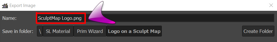
Go to "File" > "Export As". 
In the new window, pick the save location, and a name for your new Sculpt map. Make sure to enter the suffix .PNG behind the filename. 
When you're done, press "Export" on the bottom of the window. 
 

Note: 
In Gimp, you can save your files in a lot of different formats. You can determine the file format by typing the according file extension directly after the file name. 

In this case, we need to save it as a .PNG - file as this format supports transparency and also has the capability of saving the color values of transparent pixels - the very feature we relay on for our fancy sculpt map protection trick. 

After we have hit "Export",  we will get a list with options.
You can leave everything on default, but you need to check the box "Save color values from transparent pixels".
This is essential - without this, our trick won't work. 
 

Remember how we set the lower sculpt map layer to 1% Opacity? Even though the layer now appears invisible, the colors are still there. That's also why we had to make sure that this layer is visible on export. 

So with both Sculpt map layers visible, the logo layer either deleted or invisible AND "save color values from transparent pixels" CHECKED, we can hit the "Export" button. 

And here is our fancy new sculpt map, with logo, ready to be uploaded to Second Life! YAY!


Step 8: Uploading to Second Life


Yesyes, I KNOW you know how to upload stuff to Second Life, no worries. 
 
oh... you don't?
Well, it's easy: In your viewer, go to the top menu and select "Build" > "Upload" > "Image".  

There's just one thing that is important when it comes down to uploading sculpt maps though:
You need to check "Use lossless compression" in your upload window.
 
 
When you upload your sculpt map, you will have to pay the upload fee of 10 L$. 
So make sure you try your sculpt maps locally before uploading them, in case the sculpt turns out distorted. This can happen with very complex sculpties. If you don't like the outcome, rework the sculpt map with a simpler logo or just set it to 1% opacity without any logo, that usually fixes it. 
 

But... why does this work??


Well, it's actually fairly simple: 
Sculptmaps use a color code to define a 3D-coordinate. The Cartesian coordinates X, Y, Z get transported into the colors Red, Green, Blue. This way, every pixel has a specified color that tells it's place in space. 

Our sculpt map still has all it's colors all over the map. Parts of it are fully visible (the parts of the logo) while other parts (the parts around the logo) are almost - but not entirely - transparent. They do, however, still "know" their color values. 
The trick is to save these transparent color values during export. The .png - format allows us to save the color values of transparent pixels, so the colors are still saved in the sculpt map, even though they appear transparent to the naked eye. 

Sculpted prims take the color values of a sculpt map and transport them back into local coordinates. They don't check for transparency, just for the color value of each pixel.
 
This is why it is so important to save the color information of transparent pixels on export as a .png file and also why we have to use lossless compression on upload into Second Life. If the color information of the transparent pixels gets lost or compromised, it will break our sculpty. 

That's it! 


I hope you enjoyed this tutorial and I could inspire you to protect your sculpt maps with fancy logos. Please let me know your experiences in the comments, I'd be happy to hear what you make with it. 
Also, if you have further questions or something during the process is unclear, just drop me a line in the comments. I'll be happy to help. 

Have a wonderful time and see you soon,
Wolf Song


Saturday, September 9, 2017

Animated Sparkling Water Texture - Tutorial for Gimp

Hello everyone,

did you ever sit on a beach in the sunlight, staring out on the water and enjoying all the pretty sparkles the sun creates on the waves?
I often thought, hey, if we could just transport this to Second Life as well.
And, guess what? Yes, we can!

So today, I want to show you how to easily make an impressively sparkling water texture.


And we will animate it:


Prerequisits: 

To make this animated texture, all we need are 2 things:

Gimp:
I use Gimp for making all kinds of textures and pictures. It's a free program and and just as powerful as other image editing programs you have to pay for.
You can download it here: Gimp


Basic Picture:
As we want to make water, we need a somewhat water colored texture or picture.
You can use every water picture you like, but the results will be better if it had some very good contrasts and is not too bright.
For best results, it shouldn't be smaller than 512 x 512 pixels.

For this tutorial, I will use an image I have found on Pixabay.


It doesn't matter if your picture is seamless - when you animate a texture in Second Life, it will ignore all texture settings anyway.

1. Making Waves:

Open your picture in Gimp.
We don't need it bigger than 512 x 512 pixels.
Go to the top menu and select "Image" → "Scale Image".
Set the Width and Height to 512. You probably need to click on the little chain if your original image is not square.


Now, as we have our image scaled, open the Filters menu and select "Animation" → "Waves".
In the window that pops up, we leave Amplitude and Wavelength on 10.0 (default).
Set the frames to 16.
This will give a smooth animation.


Click on "ok".
After the filter has done it's work, we end up with a new picture that has 16 layers - those are our frames.


We can now click on "Filters" → "Animation" → "Playback" to see how it looks like.
Very nice already, isn't it?

This way, we can already use it as a pretty water texture for Second Life.
If you don't want to add any sparkles, you can just go ahead to Chapter 3 and convert your frames into a single texture, useable for Second Life Cell Animation Scripts.

2. Adding Sparkles:

To add the sparkles, we need to add them to every single frame.
But no worries, this won't be as hard as it sounds. 😉

We will start on the top frame (Frame 16) and work our way to the bottom.
Select your top frame (in the small "Layers"-window).

Then select "Filters" → "Light and Shadow" → "Sparkle..."


In the window that pops up now, we have to make a few adjustments:

The luminosity threshold shouldn't be too high or we will get too many sparkles, so we'll leave it at 0.001.
The flare intensity might be a big stronger, so we set this to 0.50.
The spike length we probably also want a bit longer, so we set this to 30.
The spike points should do well with 4 but you can also set it to 6 if you want more of a star shine shape on them.
The spike density shouldn't be too high or it will be too bright, so we set this to 0.70.
The rest, we leave as it is, but we make sure that "Natural color" is checked.


When you're done with the settings, click on "ok".
This will distribute fine sparkles all over layer 16 (the top layer) of our image.

Now we have to repeat this for all the other layers.
I don't know about you, but I'm more the lazy type, so we will do this the easy way:

First of all, we will hide our top layer. We're done with it already, so it will only be in the way.
Click on the little eye beside the layer on the layer window. The layer gets hidden, so we see the next lower one (without sparkles).
Click on the new layer (Frame 15) in the layer window to select it.


Now all you need to do is to select "Filters" and then "Repeat Sparkle" right on top of the menu.
This will just repeat the last filter with the same settings as we had before.

Do this for all the layers of the image. Make sure you always select the new layer you want to work on in the layer window, or it will run the filter twice on the same layer (which would give very heavy results...).

When you're done, you can play the animation again to see how it looks like.

3. Converting the the layers into a single texture

First of all, you don't want so very big textures in Second Life. The bigger the texture, the longer it will take to load and the more lag it will cause for you.
In fact, there are only very few occasions we need a texture of 1024 x 1024 pixels in size at all.
But... a good animated water texture is one of them.

Still, 1024 x 1024 is all the size we need, so we will scale our water picture down to 256 x 256 pixels.
Select "Image" → "Scale Image" and enter 256 into both width and height.
This will scale all the single layers, so we don't need to worry about it anymore.

Now create a new picture in Gimp:
Select "File" → "New Image".
Set width and height both to 1024.

With this size, we can put our 16 layers into a 4 x 4 grid in the new image.

To have it easy, we will first set up a grid that "catches" our single images and snap them into the right place, without any gaps or overlappings.

Open the "View" menu of your new image and check "Show Grid" and "Snap to Grid".
Then go to "Image" → "Configure Grid".


Set the Spacing to 256 in both Width and Height.

Now we need to copy-paste all our frames into the new image we just created.

Caution:
The order of the single images is important for the animation to look right later.
Start with Frame 1 (the lowest layer) and put it into the upper left corner of the new image.
Frame 2 (the next upper layer) needs to go into the next square to the right.

Here is an outline for the texture layout:


Copy-paste all the 16 frames of the water animation into the new image.
When you're done, your image should look like this:


Now all that is left to do in Gimp is to export the texture to a format that can be read by Second Life.
Select "File" → "Export As" and enter the name of the picture and the format you want to have. 
You can use .png, .jpg and .tif for Second Life.

Don't worry about the black grid lines, they won't be visible in the done texture.

Please also save both images (the animation with the 16 Frames in layers and the single texture) as gimp files, so you can still make changes in case something has gone wrong. 

4. Final Touches  

The last step is to upload the texture into Second Life.

I recommend to test the texture first in locally which is possible in most viewers. There will be an article about using local textures here soon.

For the animation, you will need a Cell Animation Script which is set to play texture animation in 4 columns / 4 rows.
A script of this kind you can find in Outworlz for free but you need to change the number of columns in the script to 4.

The script will delete itself out of the prim after the animation has started. This is perfectly fine, the script doesn't need to be in the prim, the animation will stay anyway.
This way, we reduce script lag down to 0.


I hope you liked this tutorial and find it useful. Please leave a comment and let me know about your experiences with this technique. I'm looking forward to hear about your projects. 
Thank you :)


Create a Custom Texture for Bought Mesh

  Mesh! What a wonderful and beautiful thing to have! How much detail, how many faces, shadows and SO realistic! We all want it, don't w...